
Différance 03 – Vancouver Grey
Kroma Acrylics on Granville Island is our local hand-crafted paint maker, and every year they release a special Vancouver Grey:
“Each time we grind a different colour we rinse out the mill and save the pigment residue. Over the year this residue accumulates into a beautiful sludge made up of layers of different colours. When enough has accumulated to make a batch we put it through the mill again and blend it all together to make Vancouver Grey. If you looked at this grey through a microscope you would see all kinds of brightly coloured pigment particles.”


The master mixer’s signature and date on the label by special request.


The method and composition of Vancouver Grey has a nice parallel with the idea behind my Différance series, with the differences between elements contributing as much to the meaning as the elements themselves, with meaning being simultaneously created and deferred as potential.

Différance 03 – Vancouver Grey (2022)
80 x 80 cm
acrylic and polystyrene on panel
It is 2/3 the size of Différance 02, but both are made from the same number of pieces (about 1,600).

Flat grey Vancouver skies outside created a good opportunity to take some photos.

The grey shows ambient colour much more readily than the black of others in the series. See the warm rose tint on the bottom row from a piece of foam I was using to prop up the piece for photography.


Différance 02
Even while working on the original Différance (50 cm x 50 cm), I felt that it would work as a much larger piece. Interestingly, it took a lot of trials before the surface looked right in this larger scale. The height variability of the smaller, original piece just did not translate successfully, but rather added a complexity to the depth that overwhelmed the relational aspect of the units. With the heights under stricter control, there is more balance between the localized areas and the whole.
These photos were taken with studio lighting, quite different from the photos of Différance, but the colouring is in fact identical. I need a location large enough to take proper photos.

Différance 02 (2021)
120 x 120 cm
acrylic and polystyrene on panel


Différance
A sculptural painting that reads differently depending on which quality the viewer engages with (surface, colour, edge, line, absence, repetition, shadow, etc).
Continuing my explorations into elemental oppositions. Here is a system of signs with no inherent absolute meaning, but with structural differences that draw meaning from reciprocal determination with other elements. The spaces are necessary absences that vibrate between activity and passivity, animating the full function of the elements. Meaning is created and simultaneously deferred as the infinite potential that makes it necessary, as the unknowable excess beyond our grasp.
Différance (2021)
50 x 50 cm
acrylic and polystyrene on panel
The title is taken from Derrida’s neologism “Différance“.


Elements 6×12
I previously posted a small piece that acted as a proof-of-concept for this much larger work. The smaller piece was made of 6 cm squares while this is made of 10 cm squares arranged in a 6 x 12 grid, with thicknesses of 5, 10 and 13 mm. All pieces are made from cut and sanded polystyrene foam, painted with acrylics.
Each of these elements began as improvised brushstrokes limited to circles, rectangles and triangles. Through a long process of revision and reduction they were reworked to essential forms and arranged within a horizontally-oriented grid. Any vestige of sign or reference was stripped away. What is left is a field of vision that is primed, ripe with opportunity for the emergence of relations based solely within the context of the viewer’s personal experience.

The analytical mind is quickly occupied in the essential seeking of patterns and repetitions, joints and separations, similarities and differences, and the emotional mind is then free to engage with the emerging symbols that, as aesthetic events, force us to think in terms of meaning. Just as lightning exists as potential within a thundercloud, so symbols and their meaning manifest from the potential of the individual viewer, who acts as shaman, myth-maker, oracle, conjuring representations of elemental human truths in flashes of direct experience.

The abstract painter Brice Marden, when asked how he wanted viewers to engage with his work, said, “Just pick a line and follow it. Hopefully, you begin to disappear.”
Pick a shape and relate it to another, as a living, dynamic being rather than as an object of distraction or utility. As a wise character in Margery Williams’ most famous book says, “Real isn’t how you are made. It’s a thing that happens to you.”

Click through for more close-up photos, a video, some work-in-progress pics, and even an animation that shows several early stages.

Elements
I’ve been working with some shapes from a 2016 piece called The Concrete Content of Experience (about half-way down this page).

I selected eight shape units and cut them from sheets of foam, then painted and assembled them. Each square is 3×3 cm (about 2.5″). 
The interrelation and arrangement of elements draw the eye back and forth between similarities and differences, engaging the active mind.

Stacking the foam pieces lifts them out of the flat 2D plane, introducing depth as another dimension of engagement. Cast shadows begin to join, amend and alter the shapes while activating the environment as part of the personal experience.
(Click through for a couple more close-ups).

“Block Print 2016” Opening Night 360
One last post related to my 2016 show: some great 360-degree video shot on opening night.
Try dragging around to see the whole room while the video plays.
Thanks to Ray at main411.ca for shooting this 360-degree video.
And thanks again to Tim for having his music become the soundtrack to this video!

First Look at the “Block Print 2016” Book
Flipping through the pages of the book of pieces from “BLOCK PRINT 2016”.
The book is a large 12 x 14 inches, hardcover, and printed by Photobook.
It will be available in our store if you’d like your own copy, or send me an e-mail.
Click through to see some stills.

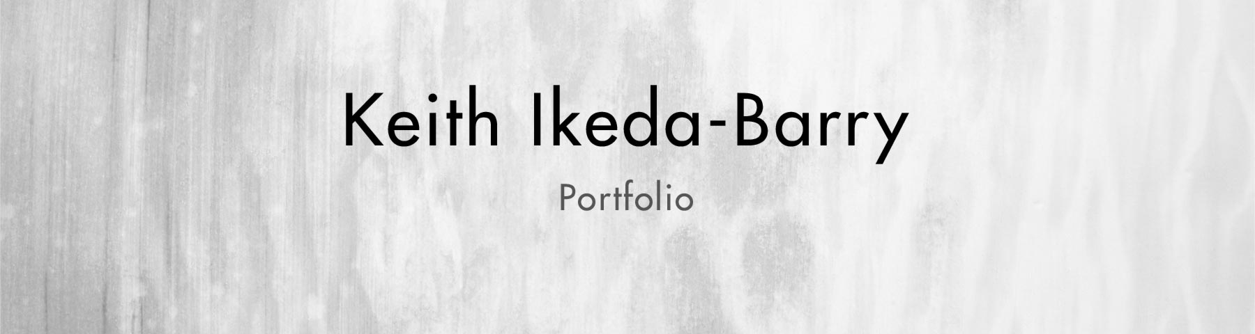
Making Block Prints With Polystyrene Foam
Using a digital projector to trace the image onto sheets of pink polystyrene foam insulation.
(Click through to see the rest of the process.)
Read More

Solo Show of Block Prints at Kafka’s
Curator Michael Schwartz invited me to have a solo show at Kafka’s. I worked most of the summer preparing a collection of block prints and a large wallpaper installation.
The show will be up until November 14th. Kafka’s Coffee And Tea is at 2525 Main Street in Vancouver, between Broadway and 10th.
*Price list of available pieces as of Dec. 10/16 (PDF link).
I’ll post more about how I made them, but for now here’s a glimpse of most of the pieces in the show.

Left: Sutra of Past Embarrassments
Right: The Unconscious Ease of Ease
Click through for more photos of the work and some shots from opening night.
Read More

Show at Kafka’s Closes
The 5th Anniversary group show at Kafka’s closed this week.
Perfect time to show some photos from the opening night party.
 Aya’s sumi-e pieces.
Read More

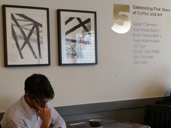
Kafka’s 5-Year Anniversary Show
Aya and I have been invited to join a group show celebrating Kafka’s fifth anniversary.
We are honoured to be included with such an amazing group of artists.
If you are in Vancouver, we would love to see you at the opening:
Thursday, July 23, 2015
8:00 pm
The show will be up for at least six weeks.

New Portfolio Site and Blog
I’ve been working hard to update my portfolio and blog site. If you’re reading this in the e-mail announcement, come and take a look.
If you’re reading this on my blog, you’re already here!

New Image Gallery Slideshows
Some of the changes to this portfolio blog include new slideshows of selected pieces and series. They are listed in the Image Galleries menu at the top of the page.
Click through for an illustrated how-to.
Read More

Master Series Workshop Residency at Atlantic Center for the Arts
Recently I attended the Atlantic Center for the Arts in New Smyrna Beach, Florida, for a week of directed individual study with arts educator Steve Aimone.
Some of the completed pieces are on display in the following image galleries:
Abstracts: Series 01
Abstracts: Series 02
Abstracts: Series 03
Click through for more photos. Read More

Blacklines
A piece that came to me in a 3am vision.
On the second-last night of my week at the Atlantic Center, a lot of experiences, impressions, understandings and ideas came together very late at night as a complete vision of this piece. Unable to sleep any more, I got up and followed the boardwalk through the trees to the studio and got to work.
Click through to see the finished piece (top image is only a detail).
Read More
Important Copyright Notice
All work linked or displayed here is copyright protected. Thank you for neither linking to nor using any material without permission.
Interested in something? Contact me.
I'm always happy to hear from visitors.
![]()
 inkandtexture.com: free inks and textures for digital artists